Website & Branding for a Hosting Services Provider
BRAND
Cyber Folks
location
Poznań, PL
Client
Cyber_Folks
Stack
WordPress
Budget
$15,000 - $50,000
People-first hosting
Cyber Folks has adopted a people-first strategy in explaining the technicalities of their hosting services. Following an extensive journey of rebranding, we had the privilege of accompanying them through the final phase of this transformation.
Vision meets design
We completed the extensive rebranding process for Cyber Folks by developing their website, a true representation of their renewed brand identity. Given clear guidelines and the liberty to innovate within those boundaries, we successfully integrated their vision with our design expertise, crafting a site that embodies both functionality and aesthetic appeal.

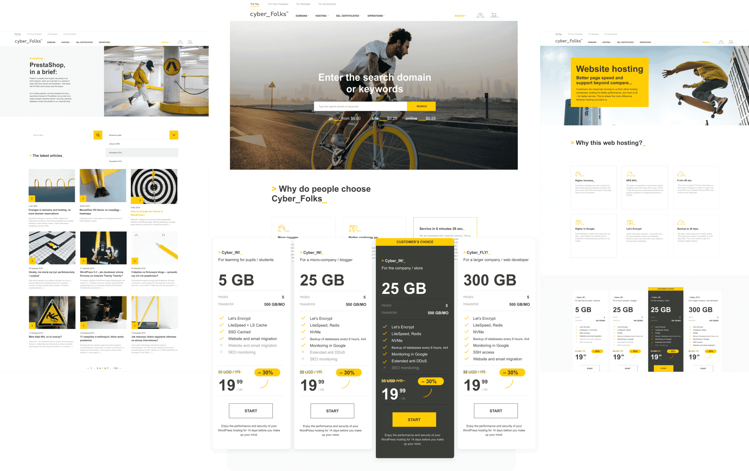
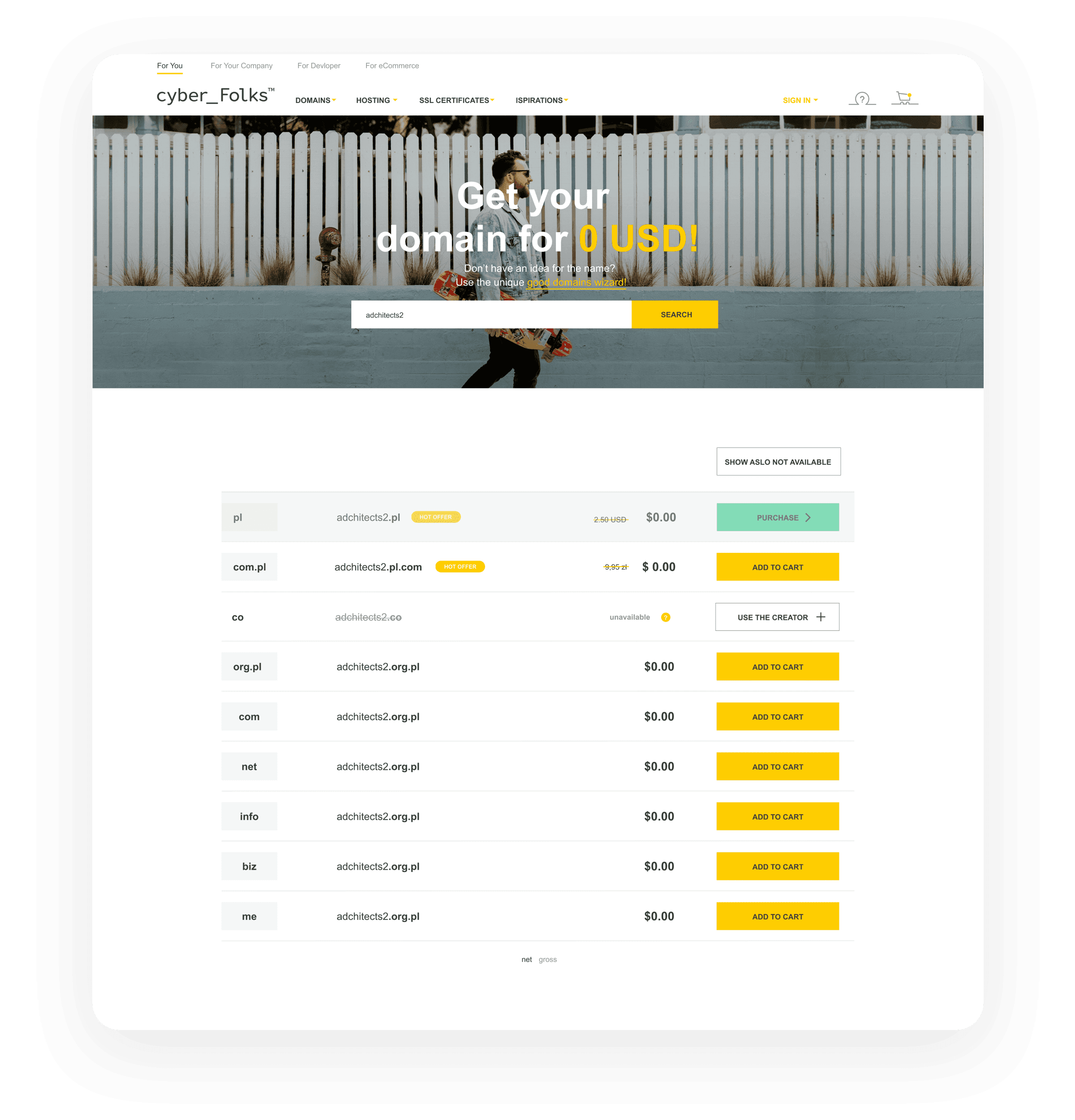
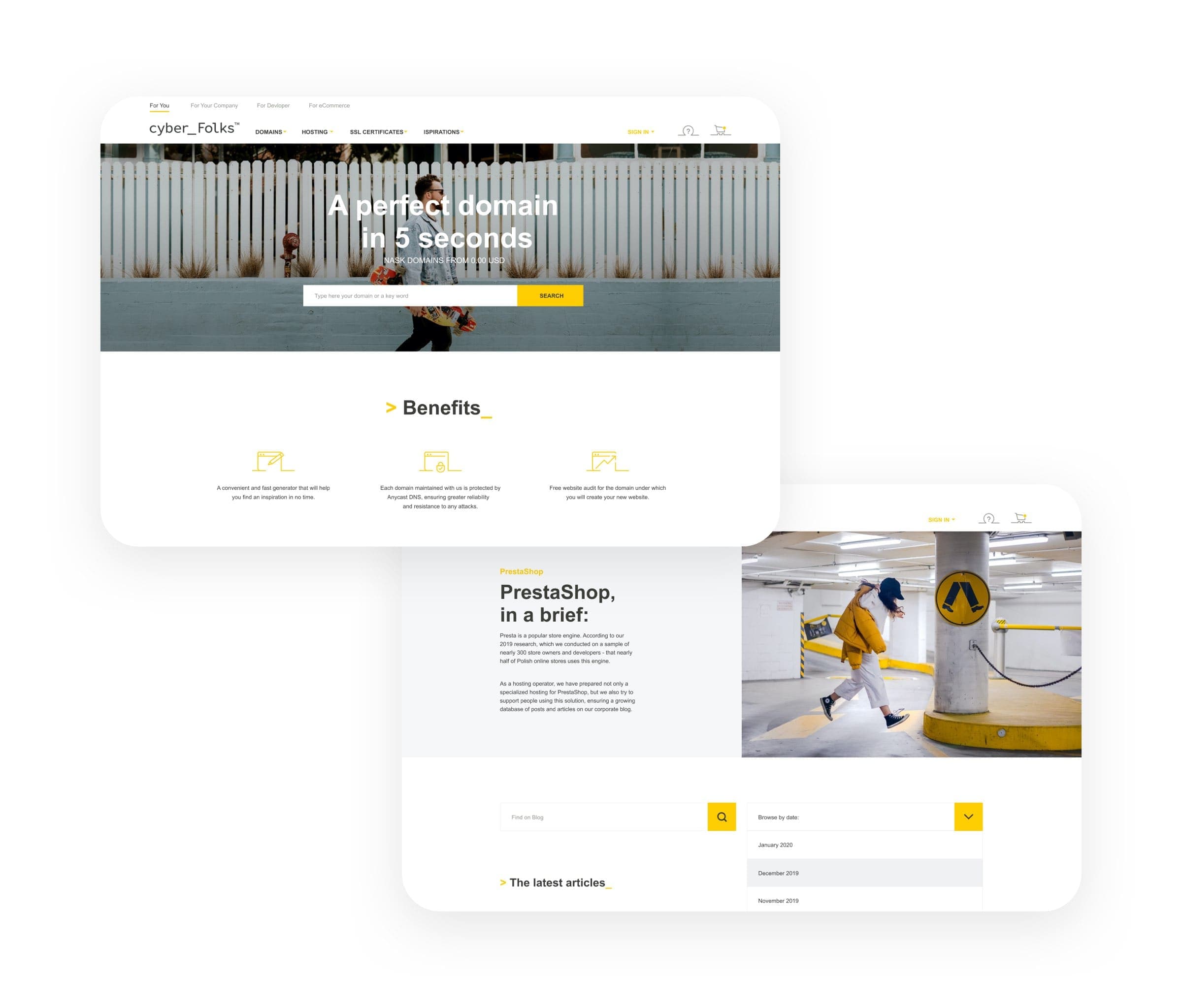
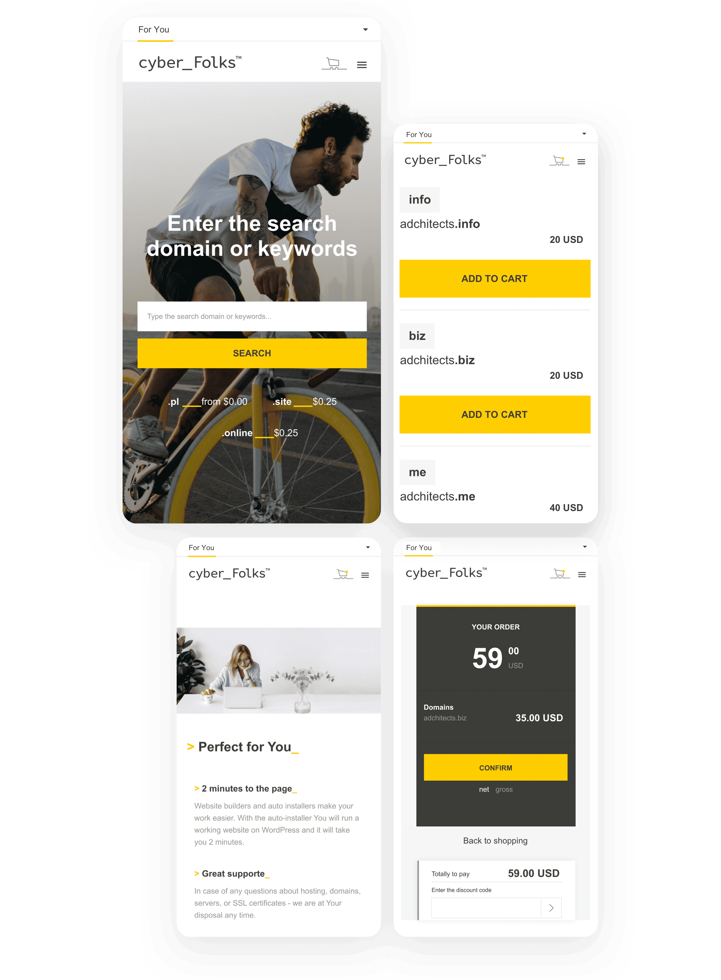
Effortless search integration
We implemented a search feature on the home page specifically designed to streamline the process of finding available domains and their pricing. It simplifies the user's journey, allowing for quick and efficient domain searches without the need to navigate through multiple pages or create an account.
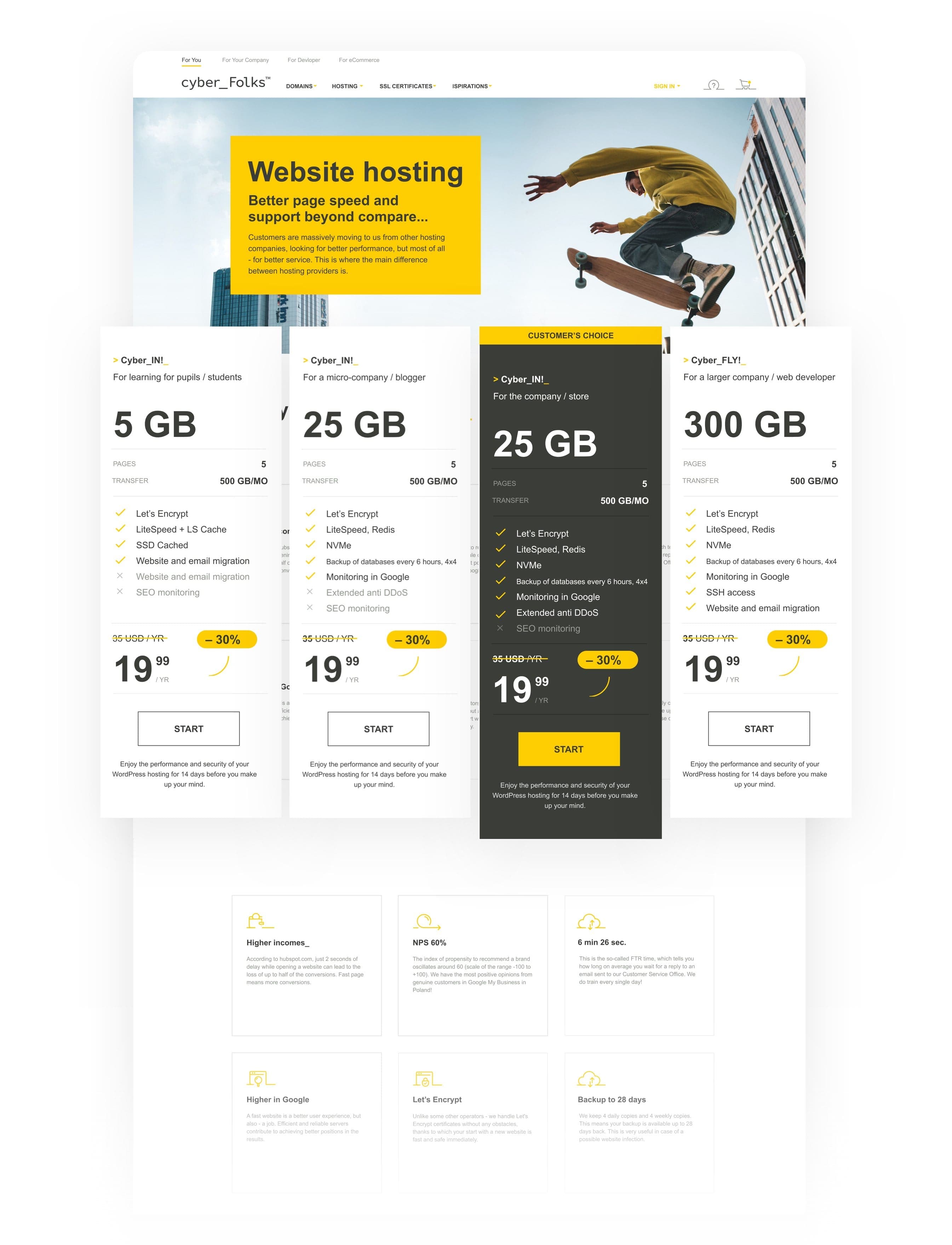
Informed choice
The objective behind the comparison page is to highlight the optimal choices for most users, while still presenting alternative options without cluttering the design. Through the strategic use of different font styles, sizes, and colors, we crafted a layout that is both informative and aesthetically pleasing, ensuring that users can easily compare their options without feeling overwhelmed.
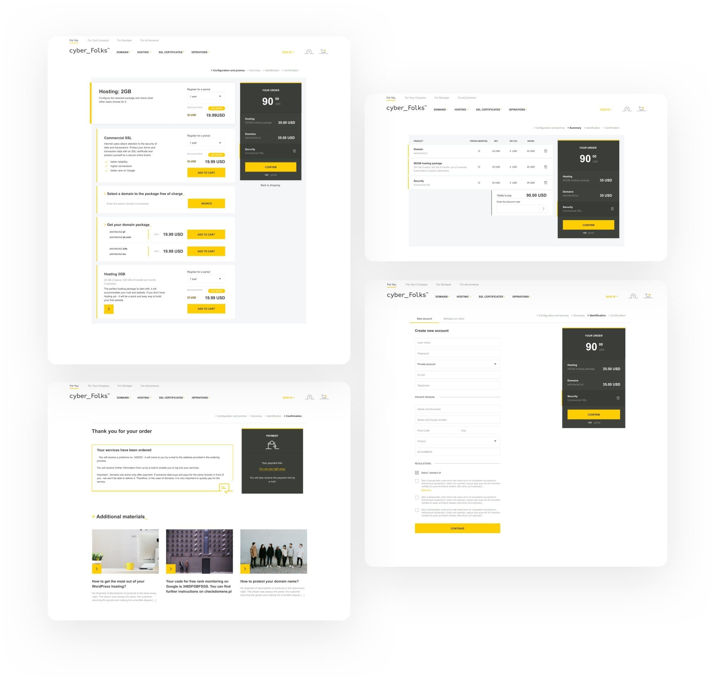
Pick what you want
We deliberately avoided overwhelming users with aggressive cross-selling strategies. The website is designed to offer additional options that can be easily added to the cart with a single click. Such an approach ensures that while users have access to more choices, they don't feel overwhelmed or pressured into making decisions, allowing for a more relaxed and user-centric shopping experience.
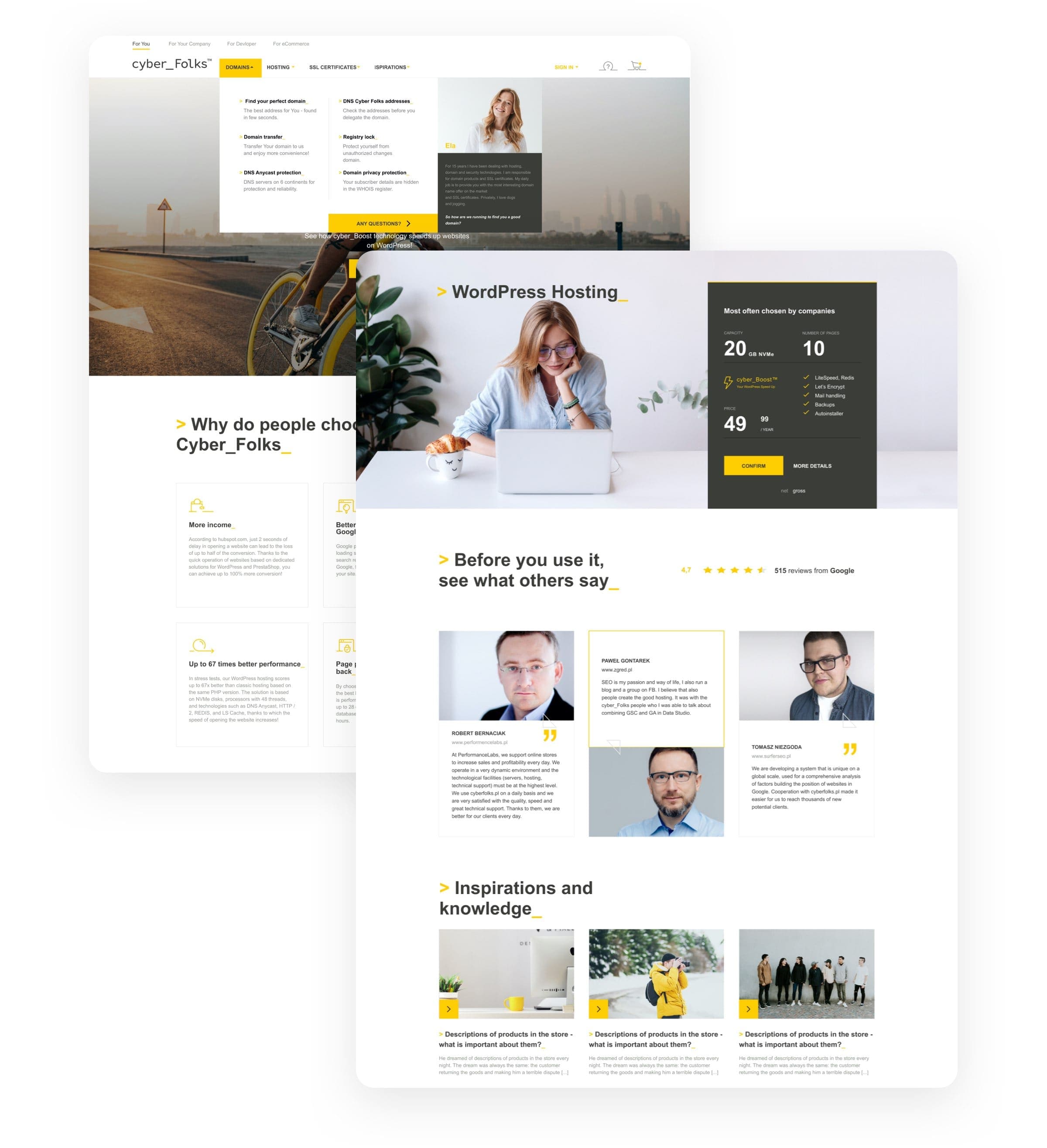
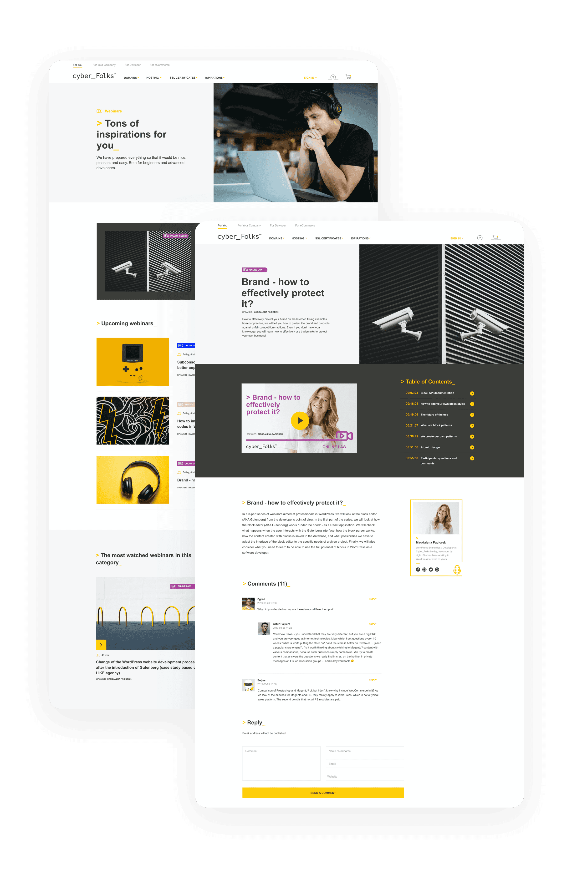
Consistency across categories
Cyber Folks offers webinars that fall into two distinct categories, which are upcoming and previously presented. To maintain consistency across both categories, we needed to ensure the webinar feature had the same layout, with variations in active elements where necessary. We developed a hybrid model that effectively serves both categories, keeping the user experience seamless and intuitive.
Adaptive design modules
A dynamic business requires a website that can adapt and evolve. Utilizing Gutenberg, we designed modular sections that allow for flexible rearrangement without compromising on design quality or functionality.
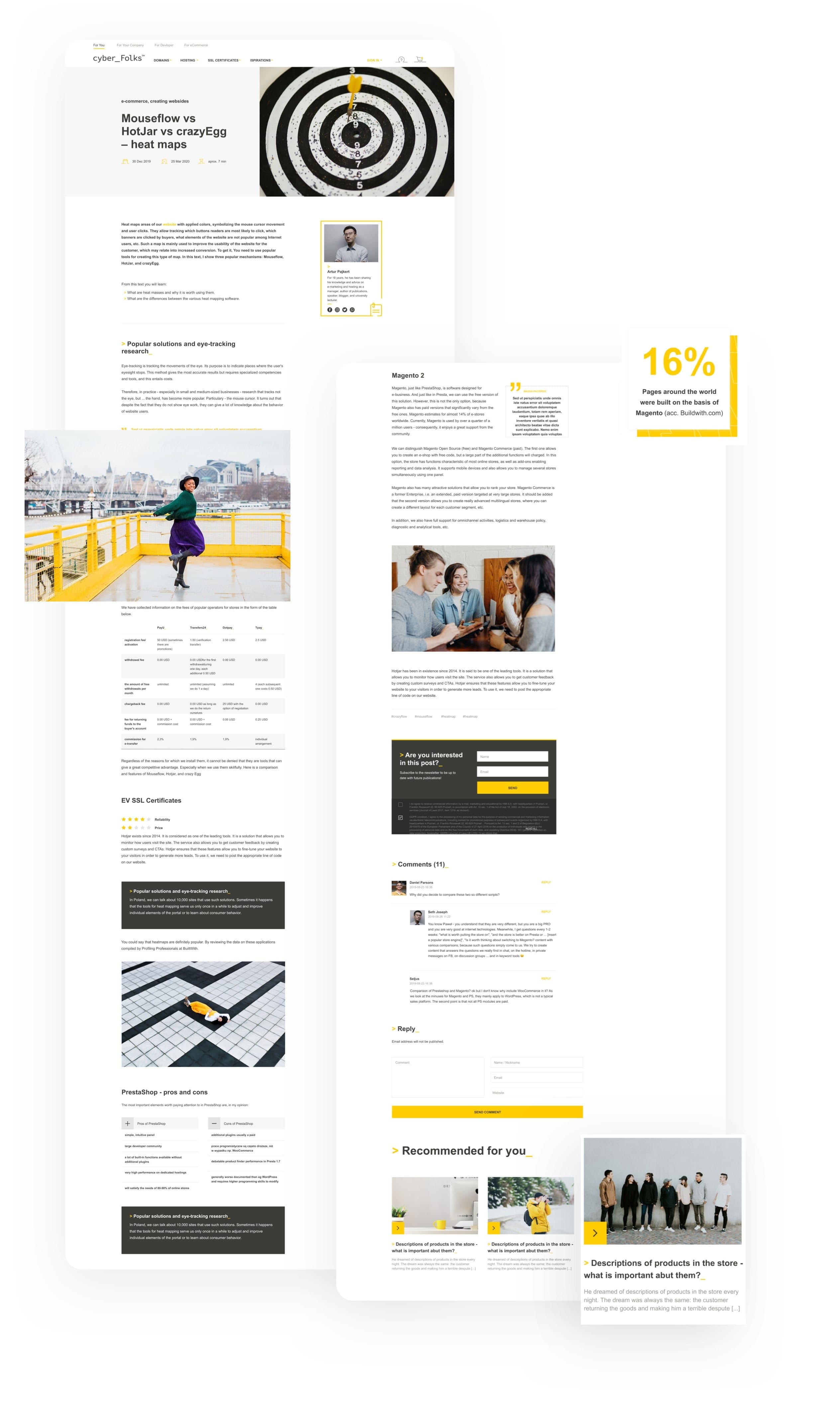
Visuals meet content
While blogs are a standard feature on many websites, they should still stand out. By meticulously spacing design elements and incorporating visually captivating photos, we've ensured that the Cyber Folks blog provides its visitors with an engaging reading experience.
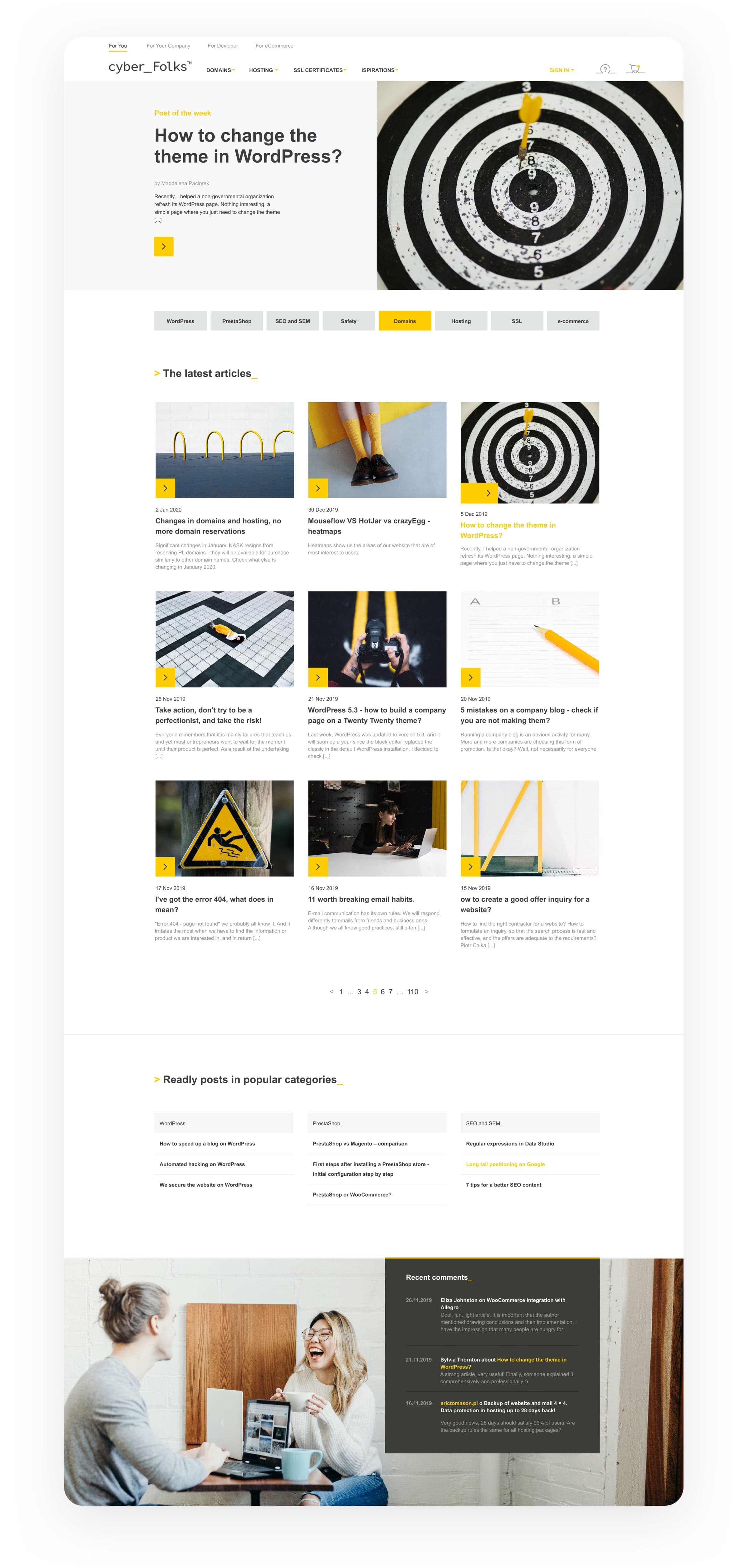
Write, insert, publish
While designing this blog, we paid attention to every aspect except the text itself. Our custom design's flexibility means content creators can concentrate exclusively on their writing. Once their content is ready, they simply place it into a template that's ready to be published.
Optimized for mobile devices
A modern website should look great regardless of what device it's being viewed on. So, after we designed and developed a website that's both user-friendly and visually attractive, we made sure that it retains its charm across a wide range of different devices.
Cyber_Folks
After the project, sales increased significantly
Customer Happiness Architect