Engaging Web Application for a Personalized Investment Plan Provider
BRAND
Derivaty
location
New York, US
Client
Derivaty
Stack
Firebase / Next.js
Budget
Confidential
Live
PROBLEM
Derivaty empowers its customers to craft their own personalized investment plans, which, with the guidance of a financial advisor, have the potential to deliver exceptional outcomes. This novel strategy sets Derivaty apart in the investment industry. To match the innovation of their service, the Derivaty team recognized the importance of enhancing their website to project a more professional and persuasive online image.
SOLUTION
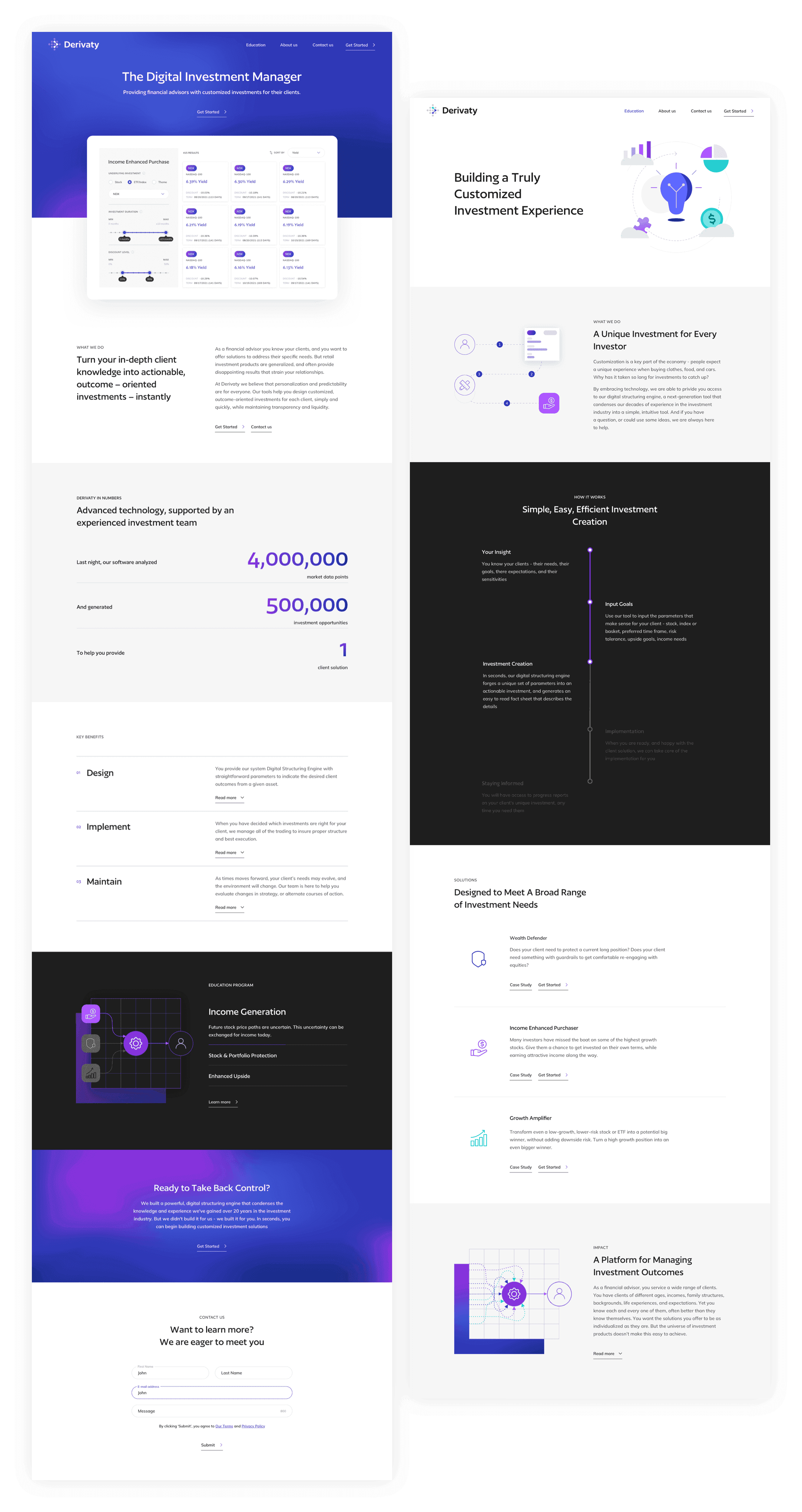
The Adchitects team envisioned a website for Derivaty that would be intuitive and user-friendly. Our aim was to streamline the user experience by guiding them through the creation of their personalized investment plan. Alongside this digital solution, we also developed a new branding strategy for Derivaty. This refreshed branding was designed to mirror the professionalism and reliability inherent to their product.
VALUE DELIVERED
Derivaty's revamped website boasts a modern design, flawless interface, enhanced readability, and numerous functionalities designed to simplify the experience for both investors and their financial advisors. Key among these features are a custom offer builder and the capability to generate and print detailed financial reports. These additions are precisely what Derivaty required to begin attracting attention.
Result-oriented finance
Derivaty presents a unique investment proposition. They propose allowing customers to design their own investment plans, which are then refined by Derivaty's advisors with suggestions aimed at optimizing investment outcomes. This concept introduces a fresh perspective to the investment industry, necessitating an online presence that effectively communicates both innovation and trustworthiness.
Customized strategy
In our approach to project management, we employ an adaptable strategy, customizing our plan to meet the unique requirements of each client. Derivaty's project was treated with the same tailored philosophy. We adjusted our workflow to make sure that every aspect of the project was aligned with Derivaty's vision and objectives.

Harmonized workflow
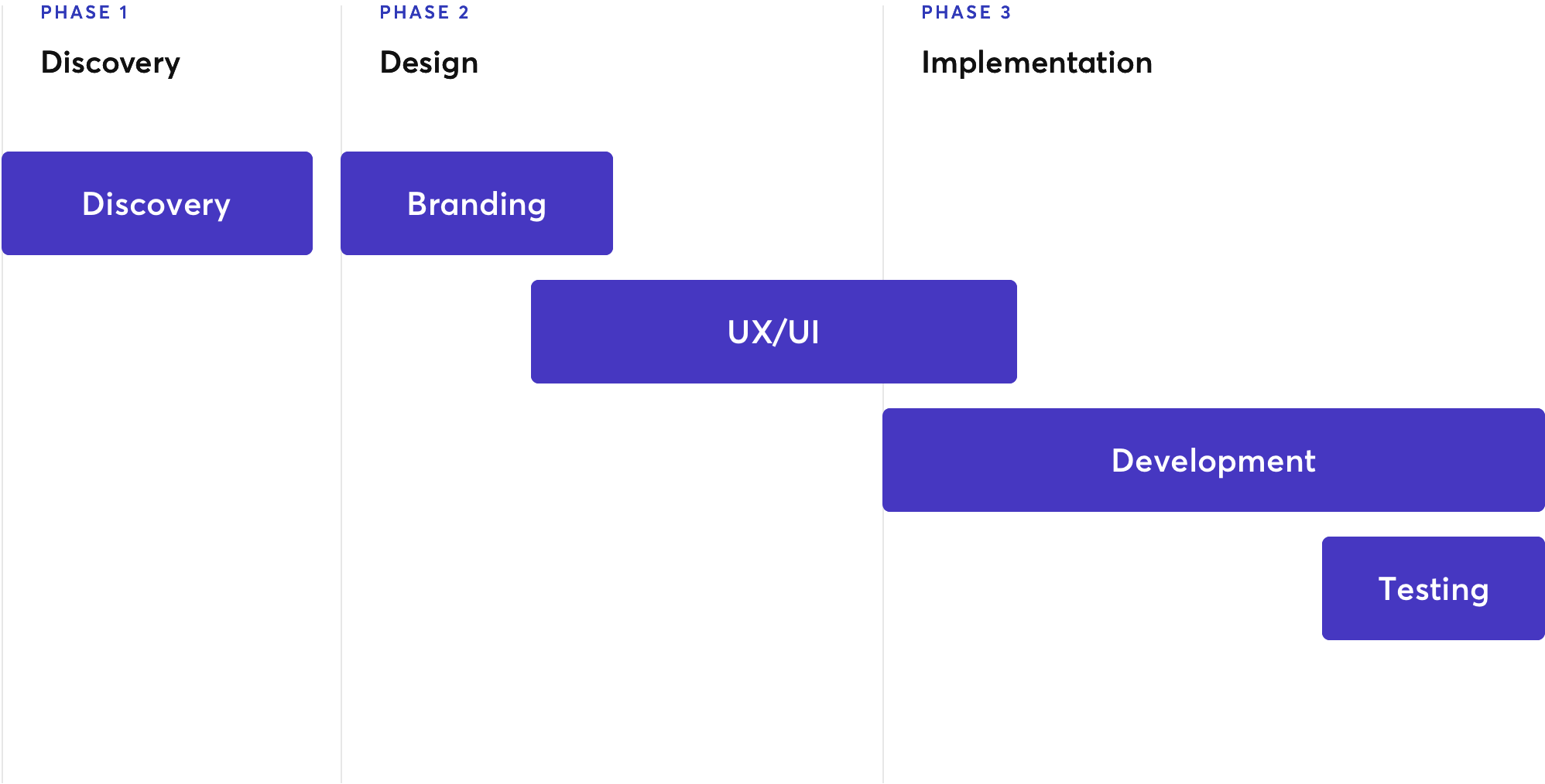
Once the plan is in place, the next step is to establish an optimal schedule. We ensure that many project phases overlap, fostering enhanced communication among design and development team members. This overlapping strategy not only streamlines workflow, but also encourages collaboration and information sharing.
Simplifying investments
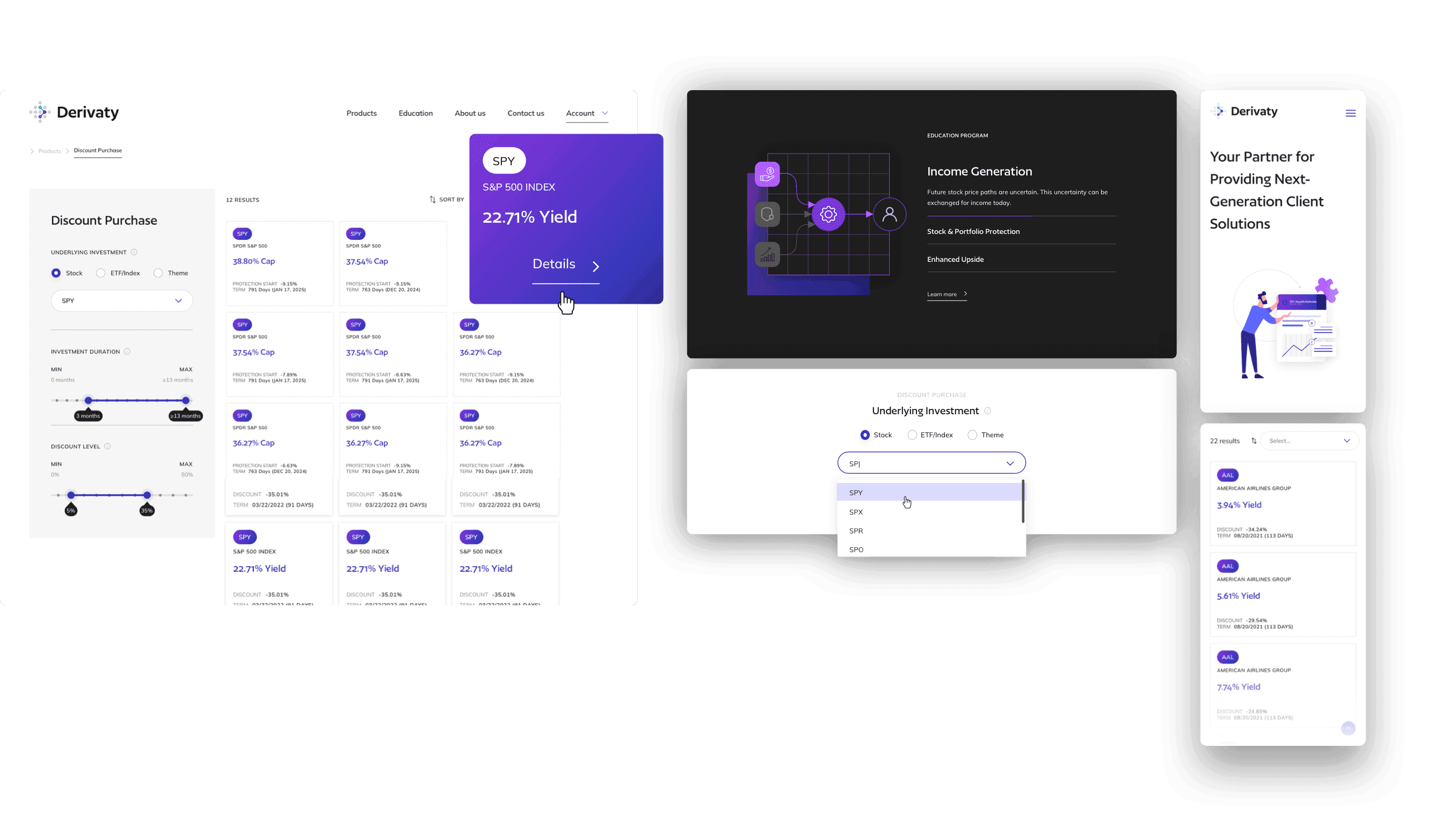
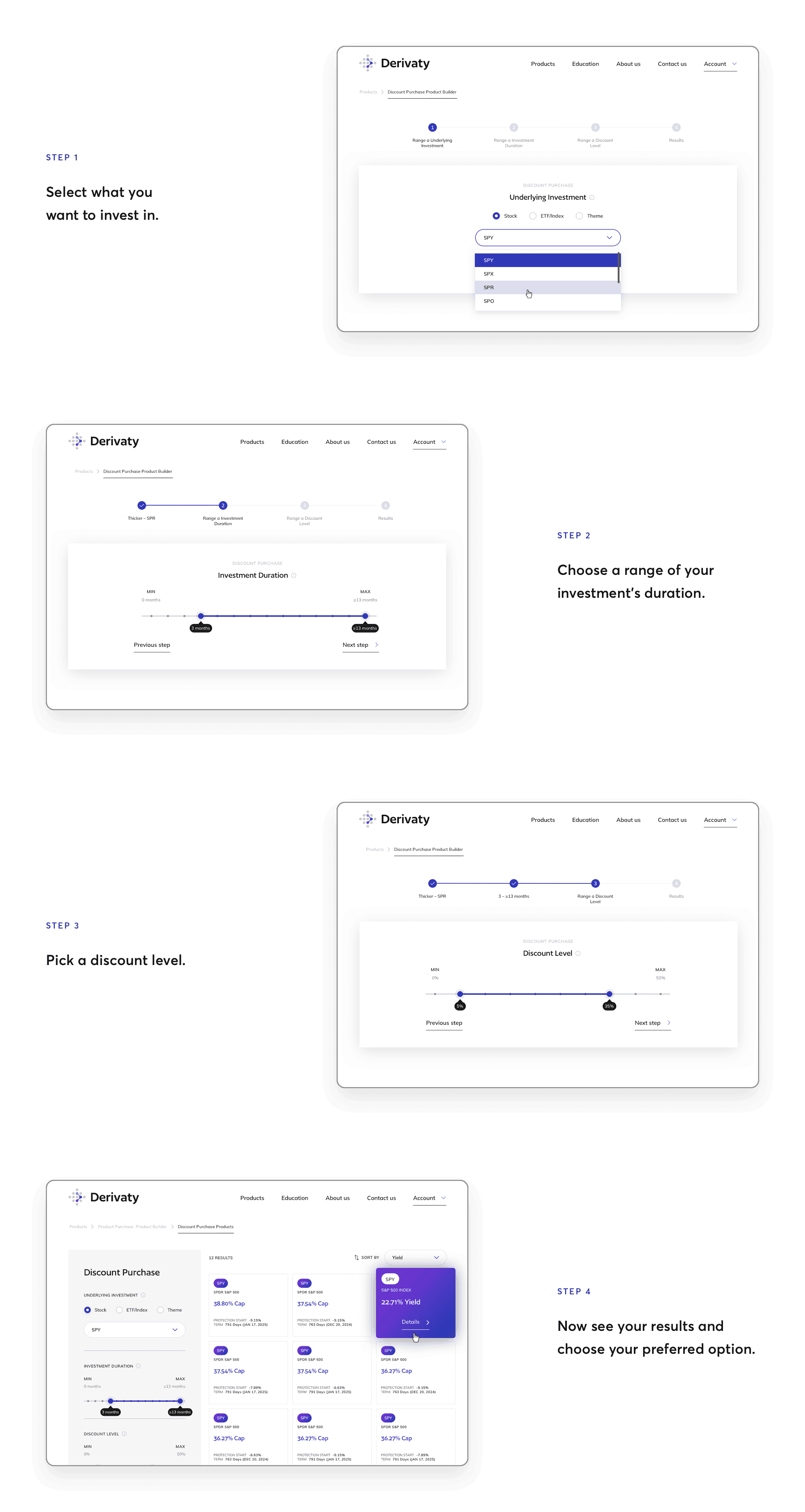
The launch of the new website was guided by fresh design and branding principles, notably featuring the ability for users to create custom investment plans through a product builder. We designed a user-friendly, step-by-step procedure accessible to even those with the most basic understanding of financial concepts.
Professional imagery, instantly
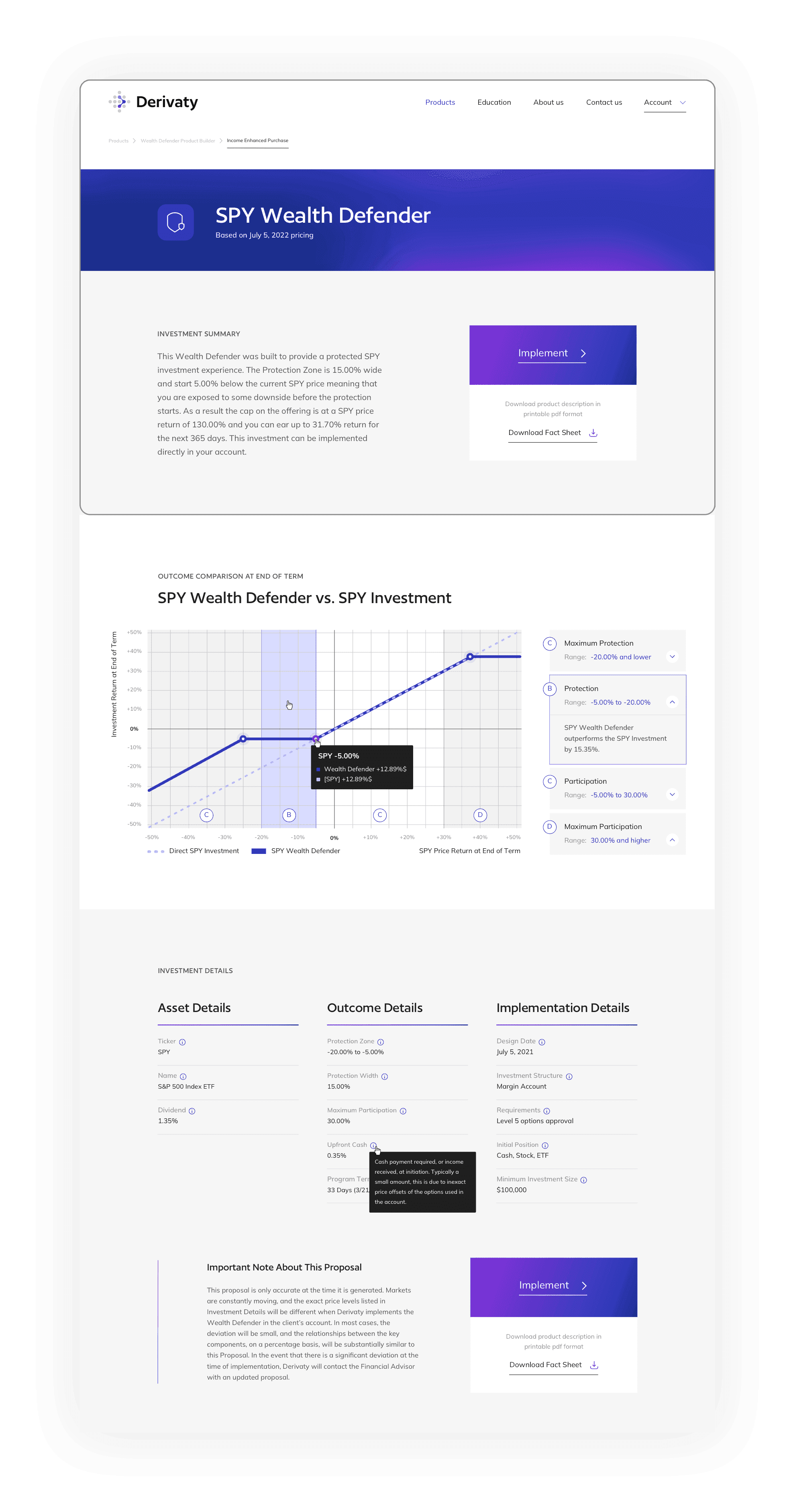
Data visualization plays a crucial role in finance, and we ensured that Derivaty's website excelled in this area. After users create their offer, the graphs, charts, and tables needed to depict their investment strategy are instantly generated. This feature is invaluable for those looking to swiftly present their plan, providing professional visuals in mere seconds.
Print-perfect proposals
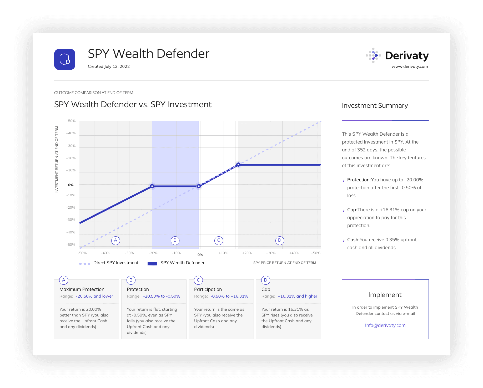
A standout feature of Derivaty's revamped website is its ability to automatically convert a custom offer into a sleek file that's primed for printing. This meticulously crafted document showcases the offer through crisp graphs and tables, which dynamically adjust based on the user's input. It's a functionality that streamlines the process of generating print-ready offers, proving to be an invaluable asset for investment advisors.
Daring to differ
For the logo's rebranding, we preserved the essence of its previous version while infusing it with new life and symbolism. We incorporated a nod to the company's name and crafted it into the form of an arrow pointing forwards. It's a symbol befitting a forward-thinking finance company.

Colorful coherence
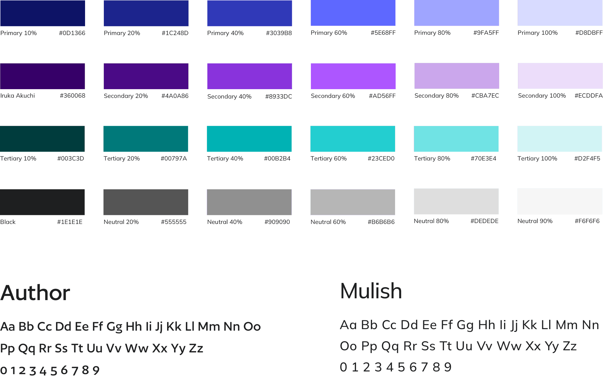
At first glance, the color palette might seem extensive, yet its coherence is grounded in the widespread use of gradients throughout the design. The vibrant hues effectively accentuate text as highlights, whereas the deeper shades seamlessly integrate with sliders and buttons, enhancing usability and visual appeal.
For typography, we selected two sophisticated sans serif fonts, Author and Mulish. These choices are not only highly legible, but also convey professionalism and adaptability, ensuring that textual content supports the overall aesthetic and functional goals of the project.
