Branding And Website Design For an American Custom Closet Market Leader

BRAND
Closet Factory
location
Los Angeles, US
Client
Closet Factory Inc.
Stack
WordPress / Gutenberg
Budget
Confidential
PROBLEM
Closet Factory asked Adchitects to work on their website. They wanted to stand out from the crowd and increase their conversion rate with a fresh and modern design. In addition, they wanted a brand refreshment that would reflect the brand's main idea, which is to design and build products that are both functional and aesthetically pleasing.
SOLUTION
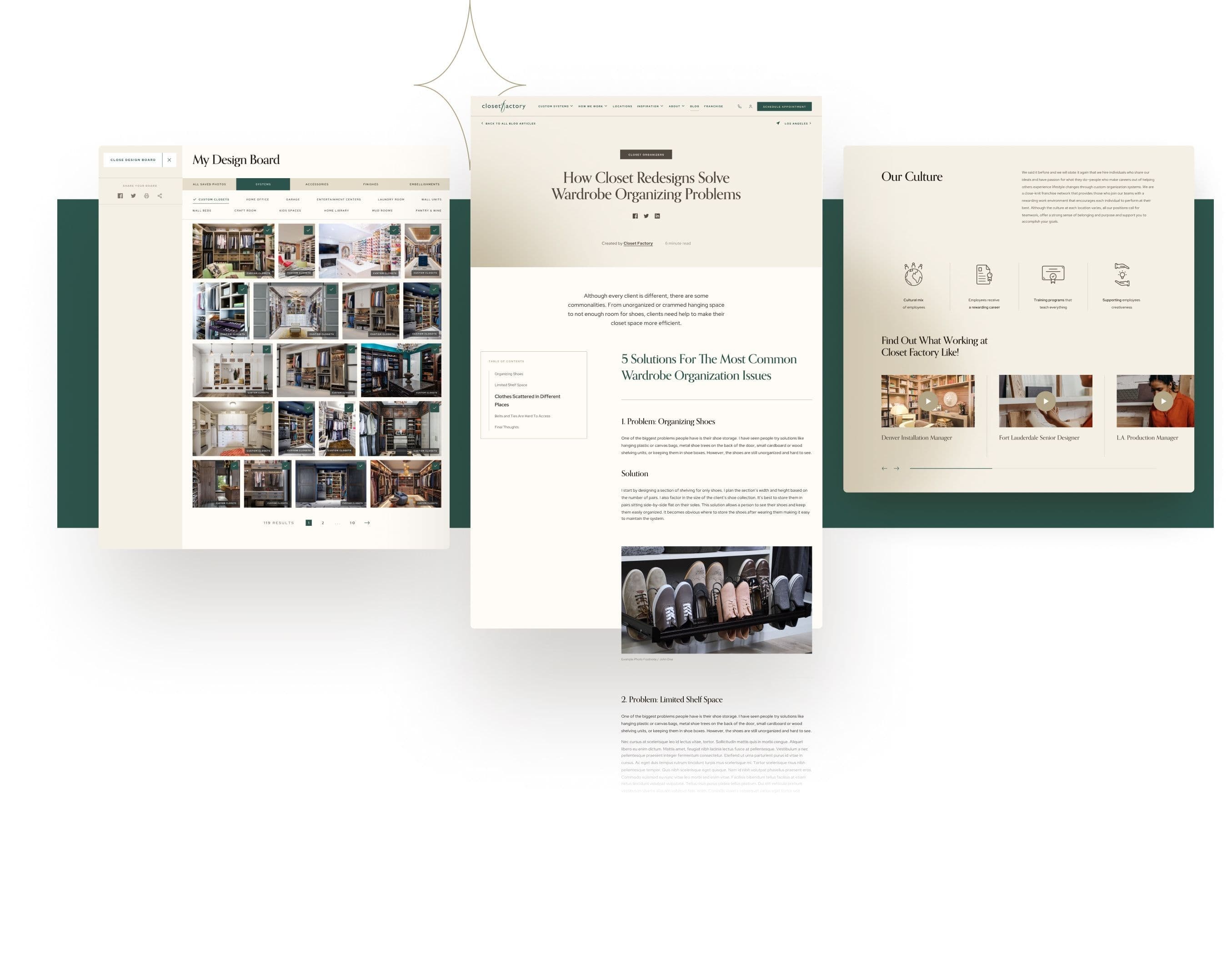
The Closet Factory branding has been refreshed. It's supposed to make people think of high-end solutions, unique experiences, and a classy style. Aside from that, the company website has been redesigned and enhanced with new features, including a special module for testimonials and big sections highlighting the pictures of Closet Factory's premium solutions.
VALUE DELIVERED
Unfortunately, the finished product never went live. If it had been published, we're convined that it would work great on both mobile and desktop devices. It would also support a wide range of new and useful features, such as a location widget, resulting in an improved user experience.
Top-quality custom closets
Closet Factory specializes in designing and installing custom organizational systems. They focus on delivering personalized designs that reflect the individual style and needs of each client, ensuring satisfaction and functionality in every project.

Branding and website design
We had two main objectives here. First, we wanted to make the Closet Factory branding modern and unique. With the help of our designers, we designed a brand book that evoked the feelings of individuality, innovation, and transcendence. Second, we were tasked with completely redesigning the Closet Factory website which, in turn, would aid them in increasing their conversion rate.

Organized and efficient
We started with a brand refreshment. Then, our designers stepped in and outlined what the website should look like. With these valuable insights, we proceeded to the development stage, during which our developers did their best to bring our designers' vision to life. Lastly, the entire website was tested by a quality assurance specialist.

Modern, harmonious, pleasant
The client specializes in delivering aesthetically pleasing and functional interior design solutions. With that in mind, we refreshed the Closet Factory branding. Moreover, we redesigned the entirety of their website so that it could provide its users with an intuitive and pleasant user experience.

Minimalistic, unique
Our team wanted to approach the logo from a slightly different angle. We worked on several different versions. We combined the existing logo with text. We also tested a number of different color combinations.

Responsive, fast, user-friendly
During the design and development process, we focused on optimizing the website's mobile version. It was supposed to help Closet Factory cater to younger users, the majority of which use mobile devices to access the internet.


Prominent, eye-catching, legible
The home page and the pages dedicated to main product categories are of utmost importance, as they contain key information about the company's key offerings and the company itself. We wanted to make them present Closet Factory's products and accessories in a way that is both eye-catching and legible.


Organized, orderly, visually pleasing
Closet Factory's previous website had many pages, most of which were chaotic and disorderly. With our help, they were supposed to become visually pleasing and easier to navigate. Instead of being static and dull, they would grab the user's attention and guide them through the website in an engaging way.

Custom-made, adaptable, varied
During the project, we created a number of custom sections and components that could be used around the website. As a result, Closet Factory's website content was supposed to become organized, easier to understand, and varied in terms of visual design and usability.

Choosing designers made easy
We wanted users to be able to have easy access to a wide range of different interior design variants. Because of that, we built a custom module that would make it possible for them to pick a specific interior designer and check out some of their projects.

User-friendly, engaging, easy-to-navigate
The entire website was designed with the end user in mind. From the very moment they enter the website for the first time, they are able to find their way around with ease. What's more, they are bound to find the entire experience to be pleasant and engaging.

Speeding things up
The previous version of the website looked rather chaotic, as its contents were placed in seemingly random components. What's more, there were few components available. So, we decided to create easy-to-use templates with a rich selection of components.

Website components made adaptable
Certain website components were made to be adaptable. You can change their look and placement using the CMS. To give an example, they can be displayed in light mode or in dark mode depending on your needs. Such an approach allows for achieving two objectives at the same time. One, you can easily change the way in which website components are displayed. Two, you can do so while maintaining a cohesive and pleasant look for the entirety of the Closet Factory website.

Detecting client location
We designed a special location widget. It would allow website visitors to quickly check whether Closet Factory's services are available in their area. They would then be pointed to the nearest Closet Factory store, which would add to the widget's convenience and functionality.

Elegant, sophisticated, classy
We utilized the elegant serif typeface called Orpheus Pro for prominent headlines, along with a low-contrast sans-serif font called Red Hat Display. As for the colors, we combined beige and brown tones with teal green. They represent open communication and clarity of thought, both of which are qualities that align with what's important to Closet Factory. To add a touch of sophistication, we incorporated gold accents as well.


